Black Hawk
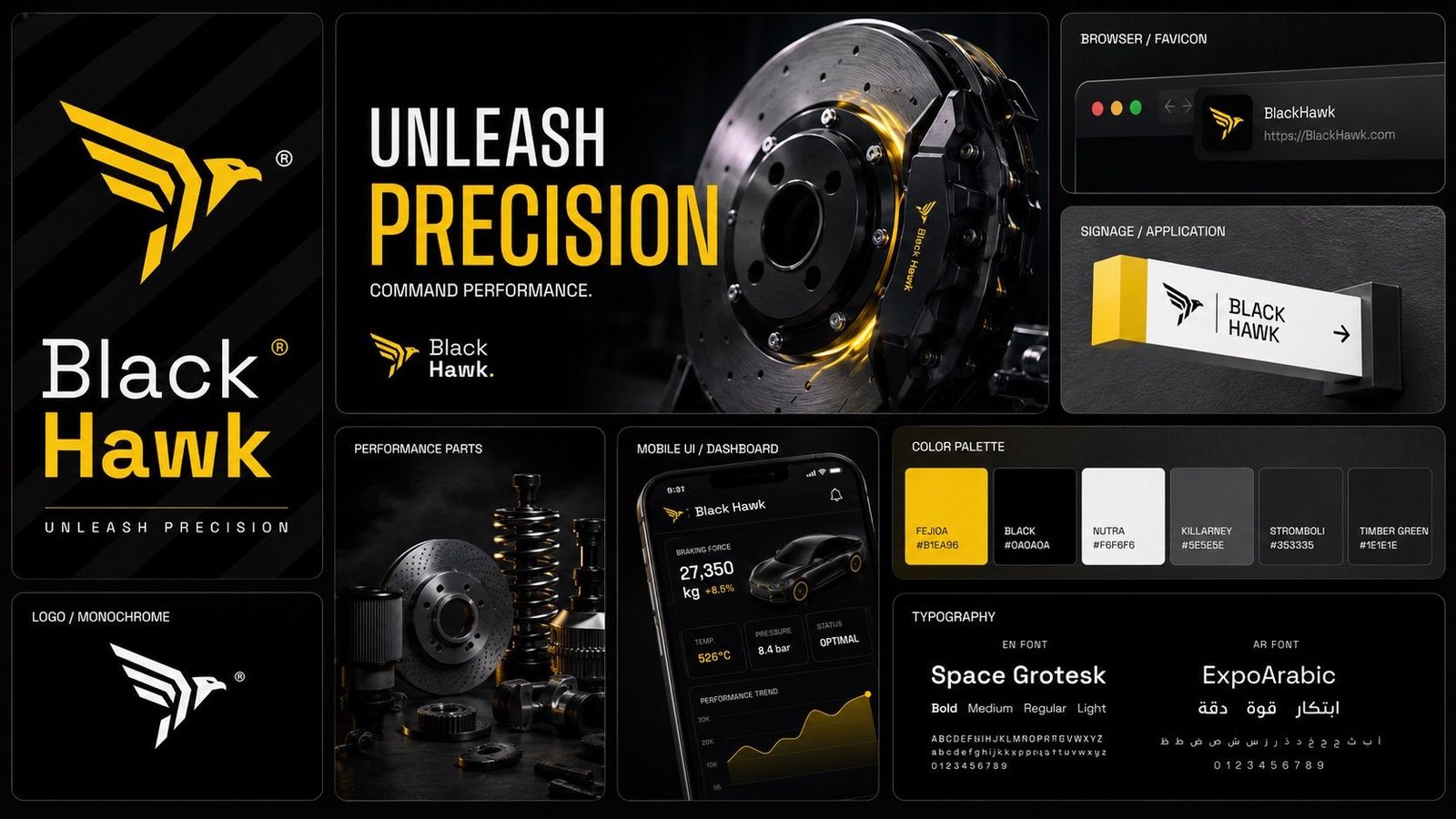
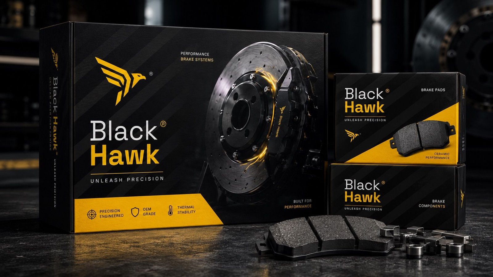
An identity for performance brake parts, carried onto packaging and service centres.
- Black Hawk
- Automotive
- Visual identity
The problem
Draft text written from the images: replace it with the project facts.
A maker of performance brake parts needed a brand that looks as precise as its parts, from the box on the shelf to the service centre.

How we solved it
We drew a hawk in sharp angles, set it in yellow on black, and built the packaging, the service centre signs and an app dashboard on the same angles and the line "Unleash Precision".


Deliverables
- Symbol and logotype
- Packaging
- Service centre signage
- Billboard campaign
- App dashboard